The CBS Said Prices Fell. Mine Say They Rose. Who Is Wrong?
Same month, opposite direction
On 15 October Israel's Central Bureau of Statistics published the consumer price index for September 2026. It fell by 0.5%, a sharp drop that beat forecasts of 0.2% to 0.3%.
My index, over exactly the same month, rose by 0.5%.
Two indices, one period, completely opposite directions. So who is wrong here?
The short answer: nobody. And when I broke both of them apart I found something I had not expected. They barely disagree at all. On every point where a real comparison is possible, we agree. Here is exactly where the gap is born.
First, I compared the same month
Before anything else I had to make sure I was not comparing apples to oranges. My index updates daily and the CBS publishes monthly, so I took the average of every day in September against the average of every day in August, which is precisely the basis the CBS works on.
My basket rose 0.49%. The headline index fell 0.50%.
The gap is real, and it is not a timing artifact. So I kept digging.
Then I split my basket in two
This is where it gets interesting. The CBS does not count "food" as a single line. It separates food from fresh fruit and vegetables, and reports them separately. So I did the same: I split my 37 products into two groups and computed a monthly change for each.
| Group | Mine, September | CBS |
|---|---|---|
| Fresh fruit & vegetables | +4.08% | +6.6% (fresh vegetables) |
| Packaged food | -0.17% | -0.4% (food excl. fruit & veg) |
| Whole basket | +0.49% | -0.50% (headline index) |
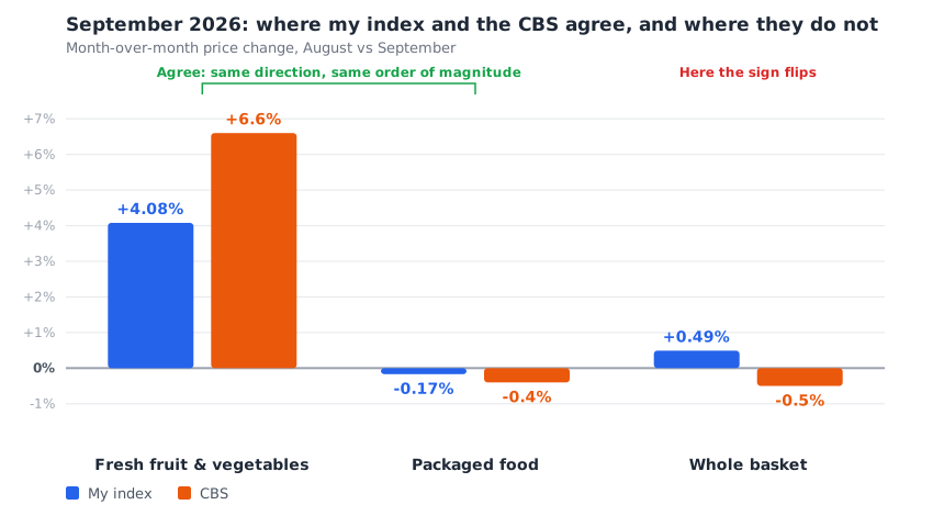
On the first two rows we agree. Only on the third does the direction flip.
Look at what happened here, because this is the heart of the story. In both groups that can be compared, the CBS and I move in the same direction and in the same order of magnitude. Vegetables got sharply more expensive for both of us. Packaged food slipped a little for both of us. We have no disagreement whatsoever about what is actually happening to prices in the shop.
The gap is born only in the last row, in the summing up. So where does it come from?
The answer is weight, not data
It all comes down to how much room each product takes up in the basket.
I have 6 fruit and vegetable products out of 37, and my index gives every product equal weight. So vegetables are 16.2% of my index.
For the CBS it looks completely different. According to its official weights table (the January 2025 basket update), out of the basket's 1000 points: food excluding fruit and vegetables gets 148.52 points, fruit and vegetables together get 30.56, and of that, fresh vegetables get just 14.39. That is 1.44% of the basket.
Fresh vegetables take up about 11 times more room in my index than in the CBS's.
So the very same price rise moves the two indices with completely different force. That 6.6% jump in vegetables contributed roughly one tenth of a point to the CBS headline, almost imperceptible. For me, the same rise lifted the entire basket.
And the arithmetic really does close: 16.2% times the 4.08% rise in vegetables, plus 83.8% times the 0.17% fall in packaged food, gives a rise of about 0.5%. Which is exactly what the index did.
And the second reason: most of their basket is not food at all
This is the part that is easiest to miss. All food together is only 17.9% of the CBS basket. Everything else, 82% of the index, is rent, transport, education, clothing, culture and entertainment, and communications. I measure none of it.
And September's fall came from exactly there: culture and entertainment fell 2.7%, transport fell 2.5%, and clothing and footwear retreated 0.9%. Those are the sections that dragged the headline down. My index has nothing to say about them, because it does not measure them.
So when the CBS says "prices fell", it is saying something true about the overall cost of living. When I say "prices rose", I am saying something true about what is happening on the food shelf. Two true statements, about two different things.
What you should know about my index
I would rather say this out loud than bury it in the small print:
- My index is equal-weighted. Every product gets the same weight, regardless of how much of it people actually buy. The CBS weights by real household spending. That is my choice, and it is exactly what makes my index so sensitive to vegetables.
- I only read the chains' own transparency files. No open-air markets, no promotions, no loyalty-club prices. And it is precisely in vegetables that the swings are sharpest.
- My "vegetables" also mix in apple, which is a fruit, plus potato and carrot, which barely moved this month. That is one reason I got 4.08% against the CBS's 6.6%, which counts vegetables only.
- I measure 37 staple products, not hundreds. It is a focused picture, not a complete one.
A prediction you can falsify
I want you to be able to check me, so here is a clear bet. My vegetables have risen another 4.76% in October so far: tomatoes jumped 13.2% and onions 9.5%, on top of September's rises.
If the explanation I have written here is right, the CBS release for October, due on 15 November, must show fresh vegetables rising again. If it shows them flat or falling, this explanation is wrong, and I will come back here and say so.
📊What do you think of the way I measure?
And here is where I genuinely need you.
You have now seen exactly how this index is built, weaknesses included. I do not think there is one correct way to measure food prices, and I am entirely open to the possibility that my choices are not the best ones.
So what do you think? Should it be changed? And why?
A few concrete questions I am honestly torn about:
- Is equal weight for every product a mistake? Perhaps it should be weighted by what people actually buy, as the CBS does, and then vegetables would move it less. On the other hand, equal weight is completely transparent, and you cannot hide an expensive product inside it.
- 16.2% vegetables: too much, or actually right? Vegetables are what people feel most at the till and what moves most. Maybe it is right that they weigh heavily. Maybe it distorts the picture.
- Are 37 products enough? And if not, which products are missing for you? What do you buy every week that does not appear here?
- What should the index be answering in the first place? "How much does my basket cost this month" is one question. "What got more expensive this week" is a completely different one, and the answer changes how it should be built.
Tell me what you think in the comments below. I read all of them, and every change to the calculation method is recorded in the changelog on the methodology page, so you can see exactly what changed and when.
In short: vegetables got sharply more expensive in September, and both the CBS and I saw it. The difference is that vegetables are 16.2% of my basket and 1.44% of theirs, and 82% of their basket is things I do not measure at all. Mine is a food shelf-price index, not a cost-of-living index.